Coronavirus statistics dashboard
See it here: https://www.germanysbestkeptsecret.com/corona/
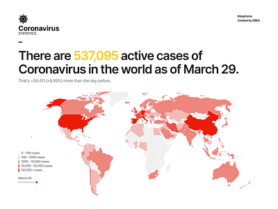
This is a side project I've been working on. As uncomfortable and scary as these numbers, it's hard to not pay attention to them right now. But we can't forget that behind every number is a person, and behind every person is a family, and a community.
Visually, I was going for a simple, stark style to match the seriousness of the situation. Content-wise it's a mix of graphs and a bit of storytelling. Many dashboards purely show numbers and graphs and make the viewer figure out what they mean. I was looking here to balance this better, so the page could be read from top to bottom like a story, alternating between text and visuals. Still a work in progress and somewhat rough, but interesting to work on.
The icon, world maps and illustrations are attributed on the site itself in the footer. Thanks to the creators for being so generous.
