Quoroom logo design and corporate identity


Check up our creative in logo design and corporate identity for Quoroom 🙌
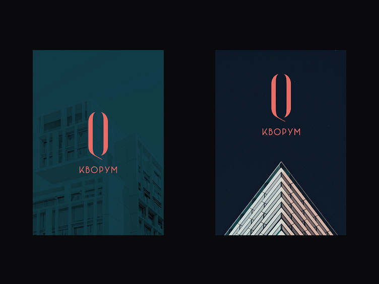
WHO: Quoroom is a real estate developer of a new format in the western region of Ukraine.
WHAT: Logo design and corporate identity
WHERE: Lviv / Ukraine
WHEN: 2019
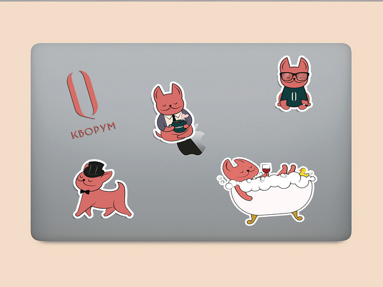
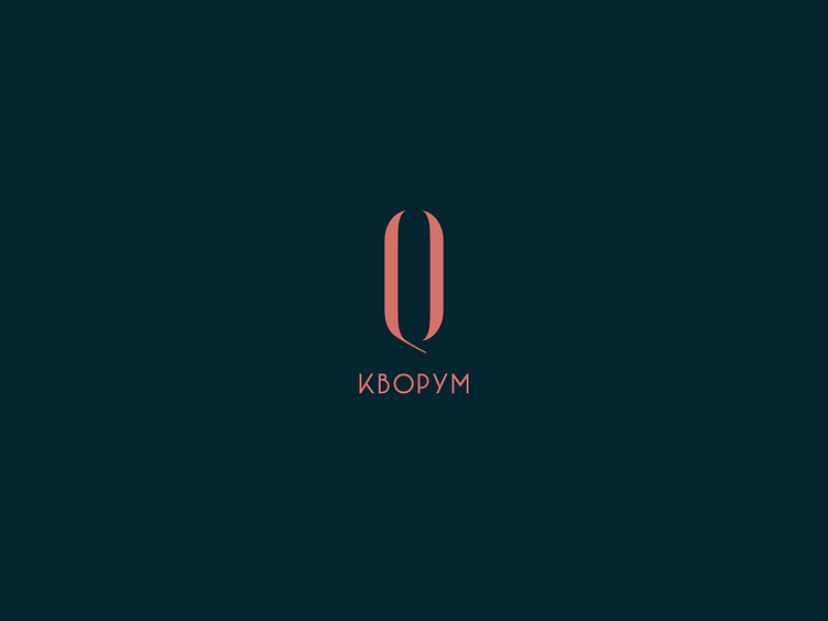
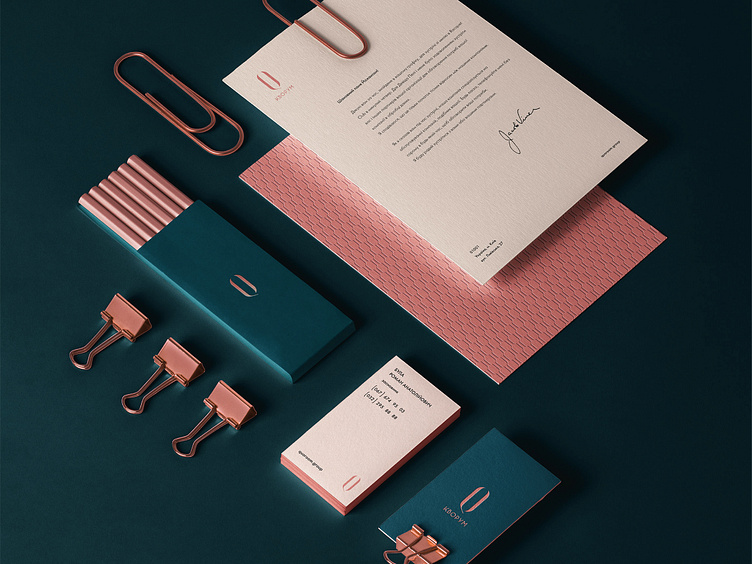
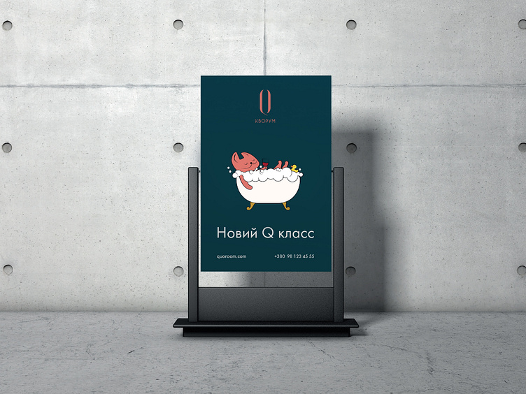
STORY: Naming and identity should show the clint’s new way, that burst patterns set by mastodons on the market. Quoroom creates closed-type club houses with developed infrastructure around the residential complex. Wrong spelling of the word quorum means that we leave a consonant meaning – “the approval of the majority”, and add our own associations. Quo (lat.) – more than, Room (English) – room. We decided to play with the letters and select Q as the main letter. Q – quality, meaning to emphasize a serious attitude to the quality of housing of the highest level at an affordable price. Visually, the logo was decorated in the form of an open door. Moreover, we decided to introduce a new concept that will be associated with the activities of the client – a new Q-class. Associative relationship with the S-Class of a Mercedes-Benz. Thus, the introduction of the Q-class concept gives a clear picture of modern housing and its level of comfort
Follow us! We promise to inspire and amaze you! -- Y Agency designers are available for new projects: http://yabloko.agency Contact us with art@yabloko.studio
Check up our creative in logo design and corporate identity for Quoroom 🙌
WHO: Quoroom is a real estate developer of a new format in the western region of Ukraine.
WHAT: Logo design and corporate identity
WHERE: Lviv / Ukraine
WHEN: 2019
STORY: Naming and identity should show the clint’s new way, that burst patterns set by mastodons on the market. Quoroom creates closed-type club houses with developed infrastructure around the residential complex. Wrong spelling of the word quorum means that we leave a consonant meaning – “the approval of the majority”, and add our own associations. Quo (lat.) – more than, Room (English) – room. We decided to play with the letters and select Q as the main letter. Q – quality, meaning to emphasize a serious attitude to the quality of housing of the highest level at an affordable price. Visually, the logo was decorated in the form of an open door. Moreover, we decided to introduce a new concept that will be associated with the activities of the client – a new Q-class. Associative relationship with the S-Class of a Mercedes-Benz. Thus, the introduction of the Q-class concept gives a clear picture of modern housing and its level of comfort
Follow us! We promise to inspire and amaze you! -- Y Agency designers are available for new projects: http://yabloko.agency Contact us with art@yabloko.studio