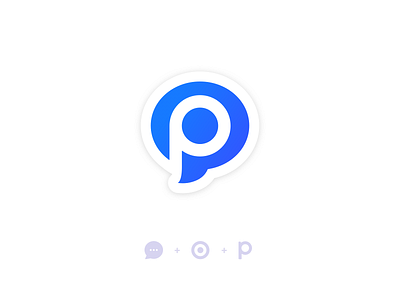
Pukka Rebranding
Glad to finally share with you the new branding of Pukka !
📱 Pukka is a mobile app that allows employees of large companies to bring up field content, to the different business department of their company)
The mission was to introduce a monogram in the new branding in order to make the brand more declinable, more friendly and also to use it as the mobile app icon / favicon etc.
After few weeks of brainstorming, and hundreds sketches, we finally finished with thoses 3 creative tracks :
1 💬 - Chat messaging : The core of the Pukka product
2 🎯 - Target : To symbolise that your information is automatically send to the right person
3 🅿️ - And the letter P of Pukka.
Really curious to get your feedback and feelings about this new logo.
(More coming in the next few day about the whole branding !)
Have a great week everyone, and stay at home ✌️


