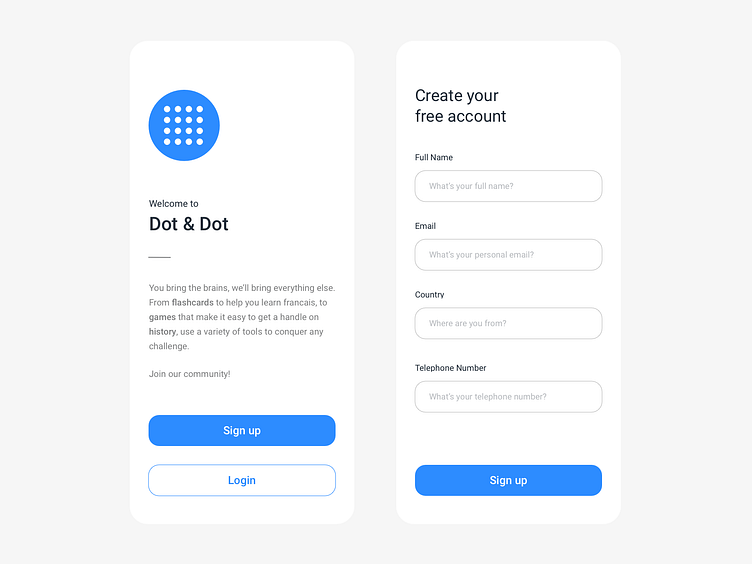
Sign up - Daily UI #11
Hi folks, I’ve designed a sign up for an educational company. So on the left side, we have the welcome page: logo, description, while on the opposite side you could see the registration form. I've tried to be consistent and clean in terms of space, typography, and color 🧮📝
More by Claudio Parisi View profile
Like
