The requirements of Less Framework 4
These are the issues I’d like to address in the next version of Less Framework. I’ve deemed it impossible to address all of them at the same time, so I need to drop at least one to advance. The ones in red are pretty mandatory.
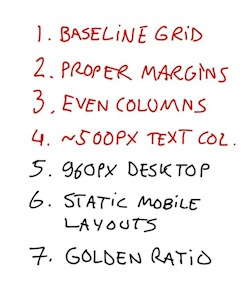
1. Baseline grid
Every layout must be based on a 24 px baseline grid. Meaning the column widths, the gutters, and the typography presets must be aligned to it. Also, the column widths and the gutters have to be the same in every layout. This makes the layouts feel consistent.
2. Proper margins
The outer margins of each layout have to be larger than 24 px; preferably at least 36 px. However, the mobile layouts can make do with around 28 px. This lets the layouts breathe.
3. Even columns
At least the tablet and the desktop layout must contain an even amount of columns. Makes it easier to design them.
4. ~500 px text column
There has to be a combination of columns that you can use to create a text column of around 500–550 px. This is usually the optimal measure for fonts around 16–17 px. There has to be a way to center this column in the tablet layout for optimal reading.
5. 960 px desktop layout
The 1280 px desktop layout has to be changed into a 1024 px one that fits into 1024 px desktop browsers. The extra space gained from going from 1024 to 1280 isn’t much use at all in most designs, since the actual content of most sites is only around 500–550 px wide (see #4.)
6. Static mobile layouts
As irrational as it sounds, fluid layouts feel awkward to me, even at mobile sizes. Would be nice if I could keep both a 320 px and a 480 px static mobile layout.
7. Golden ratio
It would totally rock if the width of the desktop layout happened to be around 1.618 times the width of the text column (see #4.)
Update: 8. Em-based
Use ems instead of pixels. Maybe. A zoomable layout would rock, but I really wish it could be done while still being able to use pixels.
Any thoughts?
And yes, I know I’m overthinking this.