logo design #1
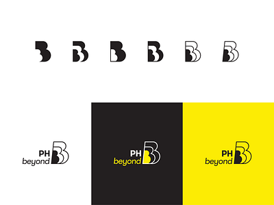
Logo design for an IT company's internal project. The concept revolved around the idea of going beyond. I used the letter 'B' and made it look like it was growing exponentially, signifying that it will go beyond the current state. I wanted the design to be minimal and bold, and I took inspiration from retro logos of the 70s.
March 2019
