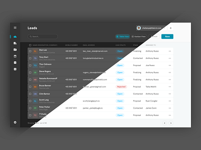
CRM Design with Dark Mode
Why should CRMs look boring? A fresh approach of CRM dashboard design with dark mode. Every app, mobile and web must have a dark mode in my opinion. Using any app for longer periods needs utmost attention and contrast plays a hug role in this. We have been using contrast inverse this whole time in my opinion. After sketch got dark mode, I cannot use the light theme. Quite frankly, I forgot about that part of my life. Now that we moved to XD, the whole light theme is bumming me out.
More by Chaitanya Alluru View profile
Like
