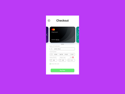
Daily UI #002 Credit Card Checkout
Today's challenge took a lot less time since I looked at a lot of work from other people to get some inspiration. I did struggle with deciding how I would like the information to be entered especially in the expiry month and year section. Another thing that I realized that I should improve upon was the choice of colors. I think with time and experience I will get better at this aspect.
The challenge for Day 2 is:
Design a credit card checkout form or page. Don't forget the important elements such as the numbers, dates, security numbers, etc.
More by Darshan Munkur View profile
Like
