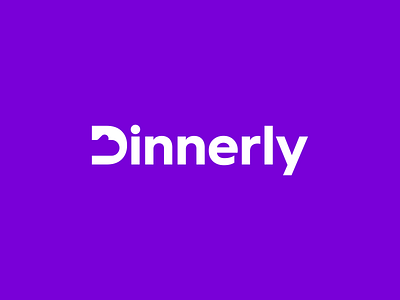
Dinnerly - Logo Redesign
Another logo redesign here.
This time it's Dinnerly, an affordable meal kit service. I felt that the current is lacking and needs a refresh. I put their oven mitt inside the letter D of a different typeface. Also, I chose a brighter purple color to make the logo stand out more.
What do y'all think? Let me know.
More by Dennis Pasyuk View profile
Services by Dennis Pasyuk
Like


