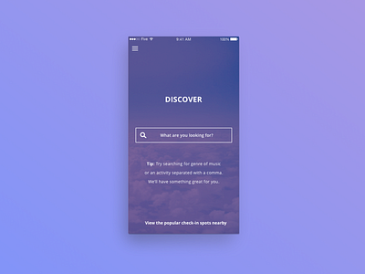
Owly Discovery UI Mock
(2017)
With Owly, discovery was the feature I had the most fun with. I tried a lot of different flows, but here was a good starting point for most of what we did with the UI. Calm, cool colors complemented the subtleties of Avenir and Avenir Next, which I called on a lot for this project.
More by Erin Kirk-Daniel View profile
Like
