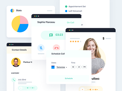
Abstract UI for Features Pages
We’re having so much fun creating these fake UI!
When we rebrand companies and work on their new landing pages, we end up creating a lot of abstract/fake UI because their current product UI does not fit in the new design. We try to stay pretty close to the experience of their product though.
Here's a series of fake/abstract UI we did for Overpass to illustration their feature's page!
Voila!
—
Work Inquiry
↳ hi@studiovoila.com
More by Voila View profile
Like
