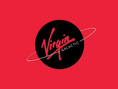
Rebranding Concept for Virgin Galactic
Hey everyone!
This is actually one of a few concepts I did a couple of years ago. I decided to reach into my archives and revisit some old concepts because of all this lockdown madness.
The Virgin Galactic branding was an easy target. I always thought their logo was lame, and that it took away from the world-renowned Virgin typography and color palette.
So, I leaned into it and made a few concepts. I'll post a couple more as well. Hope you guys enjoy! As always I appreciate any feedback and would love to connect - feel free to reach out!
More by Trevor Polk View profile
Like
