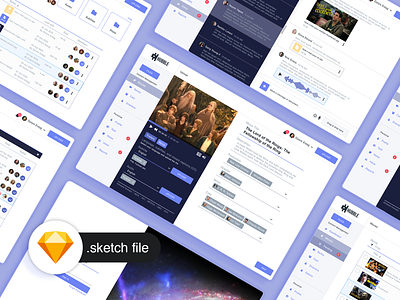
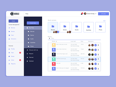
Watch Movies and TV Shows Admin Panel
Hi Dribbble.
I'm here to take a shot again for a long time. Instead of throwing a single page, I share the entire project I have done. I would be happy if you like and comment.
While doing this project, I had the opportunity to review the streaming service dashboard. I made this design that I shared by focusing on those shares.
First of all, I started by creating the flow-charter that I shared with you. After determining what will happen and what rules will happen in the dashboard, I made the style-guide I shared with you again, tried to use my favorite dark blue and purple colors and I think it was the best appealing colors for dashboards.
When I have gone to the design part, I gave importance to the use, the user would be focused on its because he would upload a movie or series, so I put the loading page in the top corner of the site and made it accessible from every page.
Since the editor will upload many movies, I didn't want him to go through many ways like going to the movies page and going back to the loading page every time, and I tried to solve this with the step by step pop-ups.
The loading page is a simple two-step design.
I thought a little bit about the thumbnail part. I created a design inspired by Netflix showing thumbnail according to the user. But I tried to develop a system that would make this system manually, not with artificial intelligence. For that I placed tags in thumbnail and poster section, adding the relevant genre and players and showing thumbnails suitable for its next time.
I hope you will like it. If anyone wants to code we can work together, I can send an entire design to anyone who wants it.
Healthy days. Wash your hands and don't leave your home if you're living in the epidemical area.


