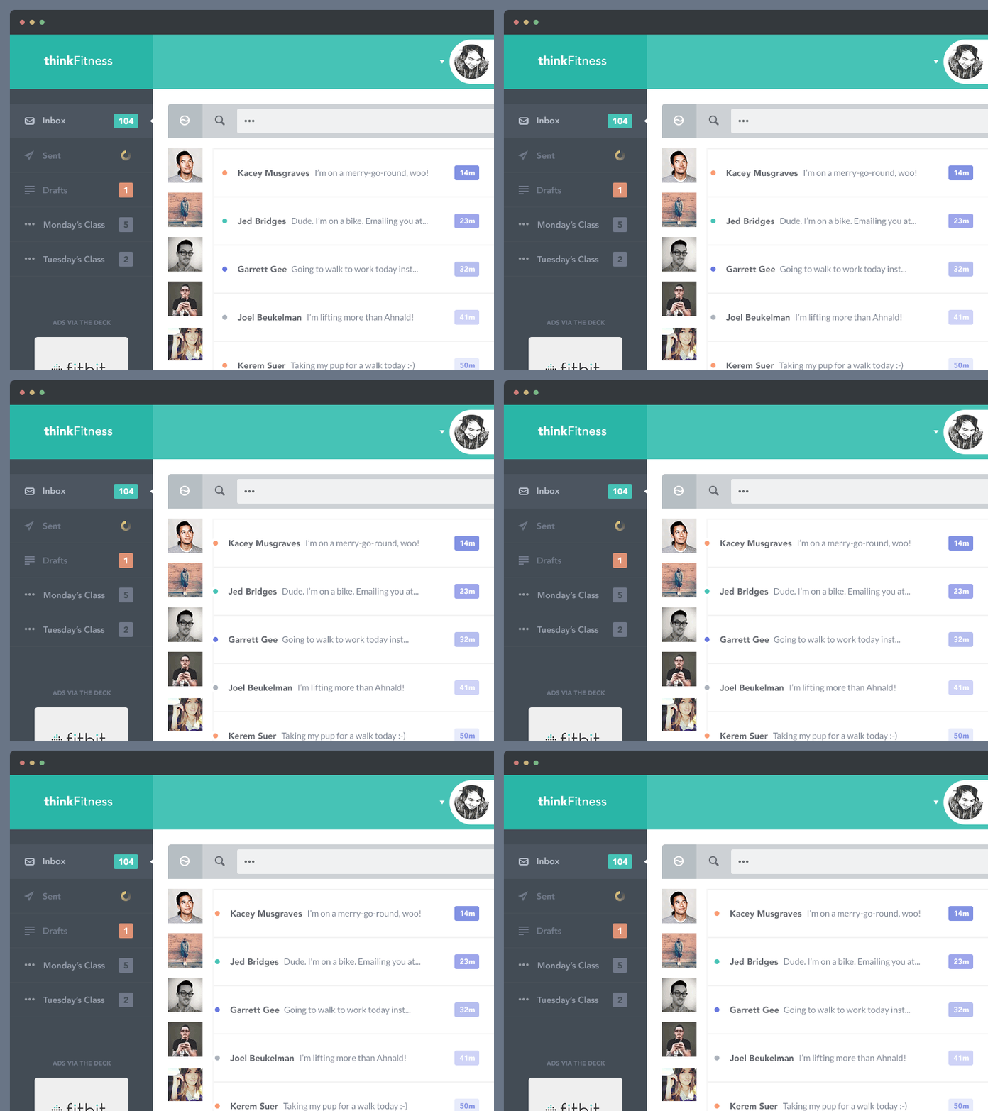
thinkFitness UI wip
This is still rough, figuring out the kinks, and there's a few things going on that wont make sense yet. But I thought I'd show you what I've been up to.
Thoughts on the placement of the Inbox? Which do you prefer Inside or Between?
Icons used are Batch from @Adam Whitcroft. Thanks!
More by Brandon Escalante View profile
Like
