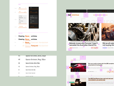
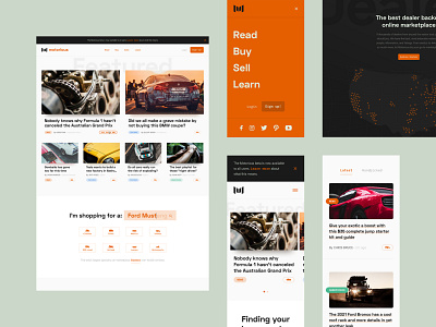
Motorious – Style and padding guide
The final shot for the MTRS project is the styleguide we built. This helped anyone (on or off the team) understand interactions as well as overall spacing for the entire product.
Normally I wouldn't make a padding guide, but for this project, it was important to establish consistencies utilizing The 8pt Grid. Although I only mocked up one page, the guide helped devs understand why certain things were placed the way they were.
motorious - mobile spacing reference.png
1 MB
motorious - mobile menu spacing reference.png
30 KB
motorious - (M) home snackbar spacing reference.png
200 KB
More by Jeremy Nolan-Cherry View profile
Like


