Motorious – Knowledgebase
Unfortunately, the knowledgebase wasn't included in the MVP, so it was something that had to be worked on in phase two.
Part of what made MTRS the "all-inclusive destination for specialty car enthusiasts" was this vehicle database. We wanted users to be able to find as much info on a particular make/model, then act on what they learned without having to visit ten different sites.
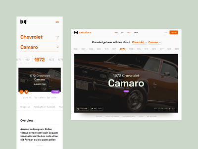
This was another instance where using Lorum Ipsum was key to figuring out an initial layout. At most, we knew a vehicle could have an overview, production numbers, performance specs, paint swatches, and PDF OEM brochures. Once completed, the knowledgebase acted as another styleguide for devs to reference in a variety of cases.
At the top, my idea for the year selector was similar to the magnify experience Mac users encounter on their dock. Scroll down past the hero image, and the section titles (below-said image) fix to the top of the screen for ease of navigation.
At this point, mobile was fairly straight-forward. My biggest struggle came from the performance specs table. It wasn't easy, but I found that fixing the title column, and then swiping the table underneath that, would be the most intuitive experience for our mobile users.


