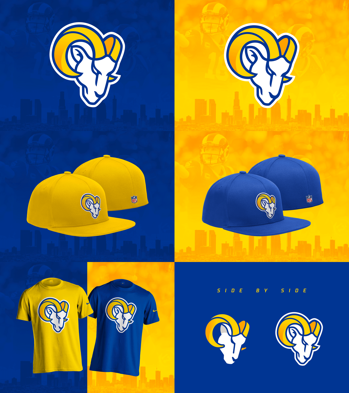
My edit of the new Rams logo
There was something bothering me about the ram head they released, and after spending a while analyzing it I think the 3 things that made it feel a bit off for me was 1)the ear 2) the thickness of the lines (or lack thereof) 3) the lack of the classic sports logo outline surrounding the whole thing.
What do you think?
More by Luis Jauregui - Edge Branding View profile
Like
