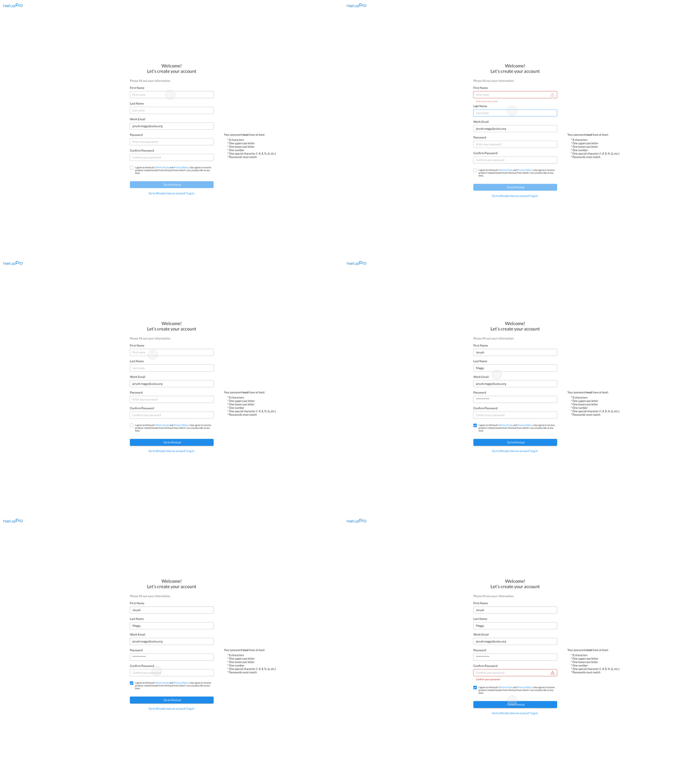
Daily UI #001 Sign Up
I have started my 100 Daily UI challenge!
Something I would like to do differently than simply showing the design is adding some design thoughts, which I learned during my own journey.
Daily UI #001 Sign Up
For this one, I'd like to further discuss the difference between 'Deactivate the Submit button (Deactivate)' and 'Leave the Submit button but use inline or popup error messages' (Alert).
Version 1, Deactivate
* Deactivate the submit button could let users clearly know there's something missing. However, if the form is super long, users may get lost and need to scroll up and down trying to figure out where is missing.
* To help with the long form, we could design in this way: Offer immediate error feedback if we detect unfinished field once users move forward.
Version 2, Alert
* Keep the submit button as it is and provide validation and feedback after users click the submit button.
* This design is best used if the task is complicated. For example, when sending emails, users may need to add recipients, subject, email body, and sending time, etc. These may not be linear like the form design and visually they may move left and right. Now it's the best time to show a clear message informing users where is missing.
Please feel free to leave your comments and any thoughts below! Let's learn together.
