Get Your Food Now Prototype
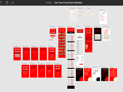
I was trying to find an elegant means to look at food after I moved away from the selection page and during checkout. I focused less on aesthetics and more on functionality. I still wanted to highlight ways to include a lot of data in terms of restaurant items, while still creating a pleasant user experience. I arrived at my design using Figma. I went for high contrast. I chose a logo that went with the theme of fast food, so I chose an animated depiction of Mercury. Red also indicates speed. Market research, as well as studies performed by auto insurance companies, have shown the color red to be associated with risk taking, and yes, speed. That is specifically why I chose that color for the background. The point was to trigger a sense of excitement in the user while incorporating contrasting white or black font colors. The goal there is to make the overall interaction comfortable for the user. As a result users would be further incentivized to use GYFN to complete their order instead of going over to a competitor's app.
