Homepage concept


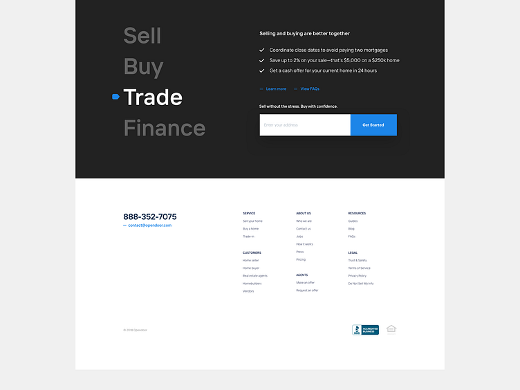


Since I'm not a big fan of neumorphism, here is redesign of our homepage is whatever-that-style-is.
I love that TT interface font BTW, so round and grotesk while still conventional enough to not shock the general public.
Giant buttons, massive white space, flat color background. So different from my usual. I took a lot of liberties here. Obviously I have time to play around these days.
Do you guys like this kind of stuff or should I stick with the regular? (strong opinions welcome)
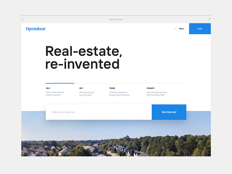
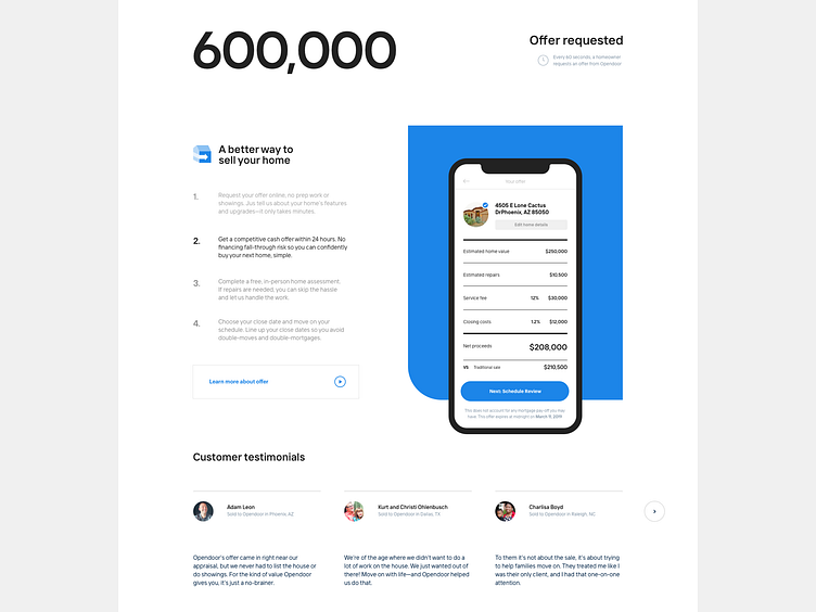
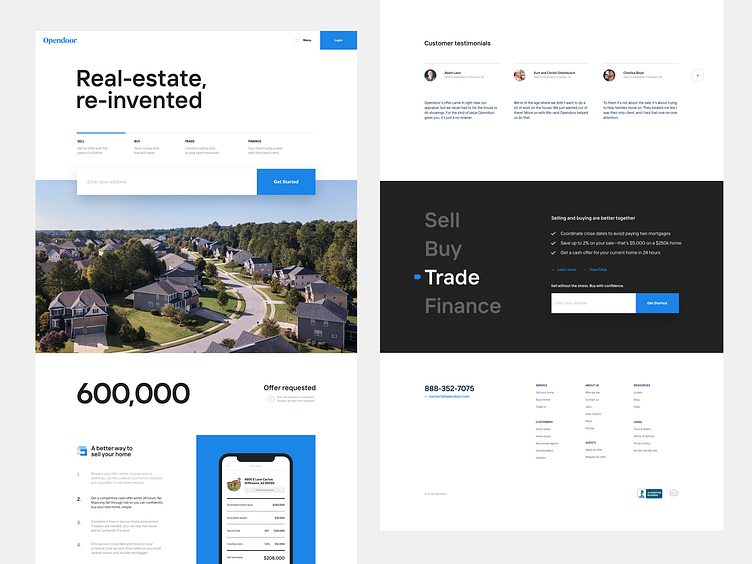