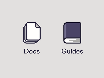
Illustration: Docs & Guides
I made these today for a website redesign I'm working on. The target audience is data engineers and I've been trying to figure out a way to distinguish docs from guides, in the simplest manner possible, of course. I like where these have ended up. The brand aesthetic has a playfulness to it so the rounded corners were a must. However, adjusting the roundedness of each corner took some serious tweaking. If you look closely you'll see that almost every corner has a different radius.
Also, I made these from scratch in Figma. Typically, I'd just make something like this in Illustrator and then copy and paste over into Figma. Long live Figma!
More by Chris Hendrixson View profile
Like
