Landing Page
//Hi Dribbblers! ✋🏼
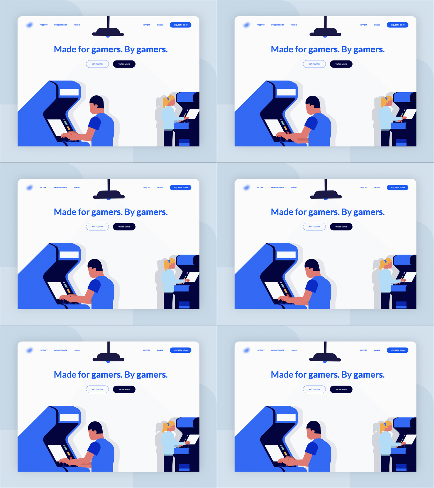
This shot is a concept for a Game Company. I tried to work with blue colors and then combining it with other neutral colors to keep it away from the overcrowded feel.
Press “L” if you like it!
More by Raff B. View profile
Like
