BEEEEEEEES

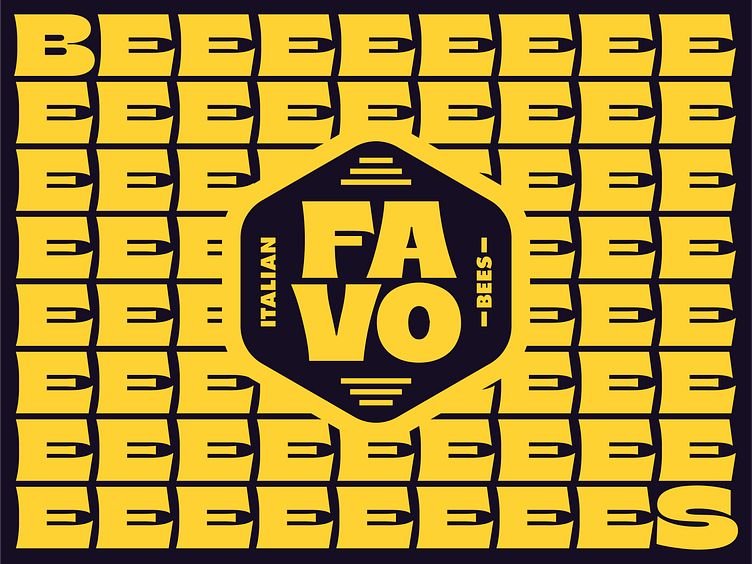


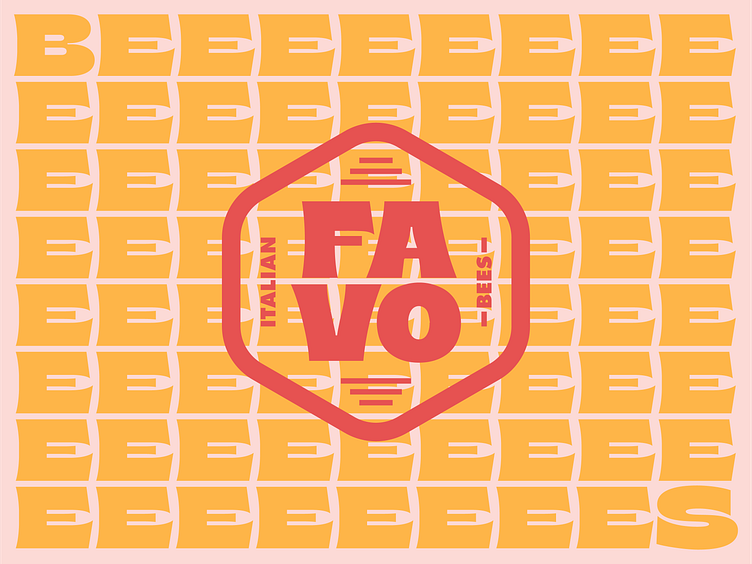
The client was way into a retro aesthetic, and when I landed in this direction, I like to stress test my design decisions by making type pairings as texture and badges and other secondary marks. I never want to present just a mark on its own before I’ve played with it a bit. I loved how these Es just stacked, and using the words BEES with tons of Es just seemed like a lot of fun and matched the personality of the letterforms.
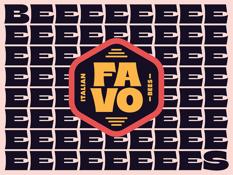
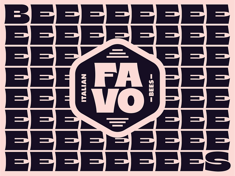
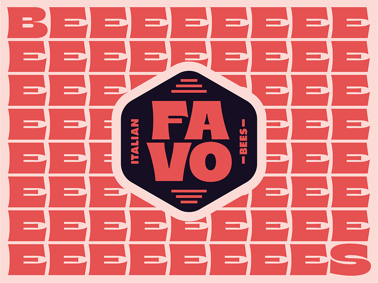
The client was way into a retro aesthetic, and when I landed in this direction, I like to stress test my design decisions by making type pairings as texture and badges and other secondary marks. I never want to present just a mark on its own before I’ve played with it a bit. I loved how these Es just stacked, and using the words BEES with tons of Es just seemed like a lot of fun and matched the personality of the letterforms.