Newlands Whisky Logo
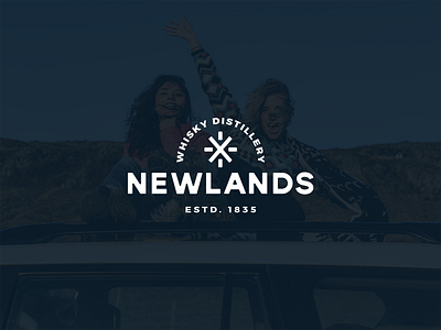
The idea behind the logo was to create a logo that on the one hand would be very modern,
contemporary and relevant and on the other keep a form that would be reminiscent of a symbol of a longtime family or stamp.
The lettering was done on the basis of a modern font and the selection of the circle symbol and caption to give the feeling of a single "badge" or signature.
The "spark" means the brand's symbol:
"Everyone has the young spirit, the spark that
makes it unique."
Full case study:
https://www.behance.net/gallery/94145129/Newlands-Branding-Identity
