UI - Onboarding Vuz App
Instagram post: https://www.instagram.com/p/By9B2OYA8ko/
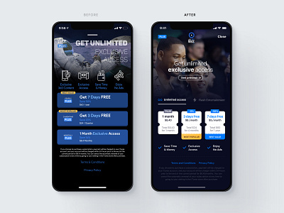
📽Here is a UI / UX improvement based on a current app subscription screen (left).
📲To put this into context, the concept of this app is to deliver immersive augmented reality content.
🔍For this work, I teamed up with UX designer, Esther who captured all pain-points in terms of usability.
🧐The main problems that we were confronted were:
- difficulty to learn how to close this screen
- the main concept (360 video content) wasn’t highlighted
- inconsistency with the iOS human guideline
- overall poor information architecture
- unclear subscription plan information
- unclear value proposition
📃This post is an overview of the result. Keep updated to see the entire process behind this work. A medium article will be shared soon.
🚀 As you can see, the right screen is the evolution.
💭 We will love to hear about your thoughts. All feedback will be much appreciated.
