Bookworm
1 Hour Logo Challenge #1 Bookworm
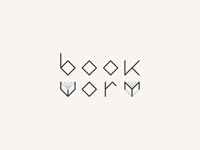
Given only the word "bookworm" for my first challenge, what first came to mind was the work of Daniel Carlmatz (👈 check him out). My ideas went for the connection of the word itself with the actual meaning of the word immediately – leading up to a design with many (as in more than one, lol) books.
The feedback that I got from Hitesh was that it felt original, as backed by a manually crafted typeface – although he was expecting more of a book-and-worm play on the logo. Putting scalability in mind, this logo design will still not be simple enough to stand alone as an icon. The grey-coloured lines in the letter W and M might lose their visibility when scaled down too. Detail-wise, he mentioned the K looked out of proportion compared to the rest of the letters.
What do you think? Please feel free to share any of your feedback below, or play along and share what you’d first have in mind if you were told to design a logo for the word "bookworm" 🤓📚🐛

