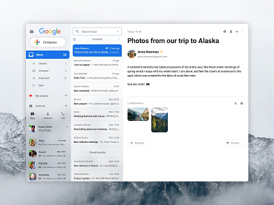
Gmail Redesign
Gmail is my favorite mailbox. Creating this concept, I was wondering what would improve my visual experience.
I decided to change the layout into 3 parts. If you would like to read mail on the whole screen you could just enlarge it in the option menu. I also used original material design icons (https://material.io/) since I think that people already know and understand them.
Feel free to comment!
More by Mateusz Jędraszczyk | Product Designer View profile
Like
