Organizing Actions
Last summer we began discussing what it would take to create a design system for suite of products at Webconnex. We wanted a system that would bring a more consistent user experience to our customers, would be a solid and also somehow more flexible tool kit for our engineers, and finally would help set more clearly defined boundaries for our design team.
A UI inventory revealed that our buttons, or actions, were one of the most problematic areas, so we began organizing and trimming down our designs until we landed on a structure that we're extremely happy with.
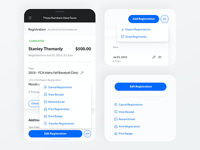
Our new actions component works seamlessly across full-page width, two column and responsive layouts.
1. A collapsed view that shows the primary actions and hides all secondary actions within an ellipses. Works well for tables or any full-width designs.
2. An expanded view that shows the primary action(s) on top with all secondary actions stacked below.
3. Both collapsed and expanded are fully responsive again taking advantage of the ellipses that reveals a popover on-click.
We're really excited about this update that will be releasing soon.