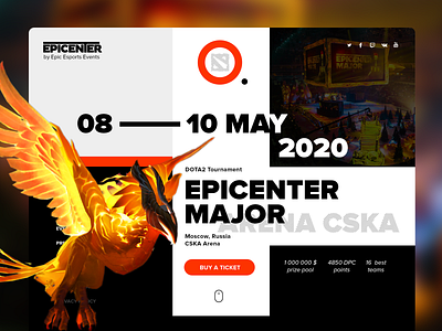
Epicenter Major website and tickets design
Hello, Dribbblers! Here are some design concepts that I've made for the Dota 2 tournament Epicenter Major that is now canceled because of coronavirus. Too bad that this kind of thing has happened all around the world lately and tons of our work just left wasted. Hope everybody stays healthy!
A couple of words about tickets UX design. We basically use tickets 3 times:
1. When we make a decision to buy tickets - we need to know where the event is happening and the price
2. When we're going to the place - we need the exact date, time and address
3. When we're on the place - we need to know where to find our seats
All this info should be as clear as possible on the front side of the ticket, other details about the organizers and rules might be found on the backside. Also, I left someplace for adv. logos on the backside of the ticket.
Do you like esports? Don't hesitate to leave feedback. Have a nice day!


