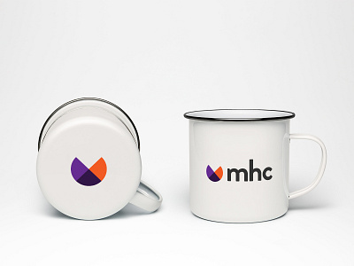
MHC | New Visual Identity & Branding
Had a great time creating a new visual identity for Marie Haynes Consulting (an SEO consulting firm), especially developing such a vibrant colour palette!
Working with geometric shapes is always one of my faves. The icon here is reminiscent of a pie graph, which touches on the work MHC does:
• Represents dealing with data
• The "missing piece" symbolizes where MHC comes in; to figure out what the issue (missing) from a website, and then help the client fix (fill) it.
• Has a sort of fortune cookie shape, i.e. “cracking open the website to see what’s inside; good and bad surprises”
The mockups here show the application of the brand across different materials, and the GIF shows how the primary logo can be reduced to the secondary logo, then just the icon — allowing for flexibility across different spaces.
(MHC actually developed a "PacMan"-esque game using the icon, which was pretty cool!)


