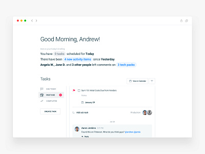
Dashboard UX redesign (After/Before)
As a user, my time is ALWAYS limited, so what I need most is a quick way to navigate through the app and understand the following:
1) Where am I?
2) How can I go back?
3) What’s the main action on the current screen?
Instead, what most products do is they push a lot of features right from the beginning on users, making an enormous cognitive load on their brain.
By nature, we have an innate aversion to complexity and ambiguity, so what you first need to do is remove FRICTION on any single screen in your user journey. Just start by removing/hiding elements that don’t support the PRIMARY user’s task (You need to know that as well) on the current screen.
Remember, as a user my focus 99.9% of the time is on the outcomes I came here to get, NOT on how many features your app has.
Does this screen help me move forward or it introduces me to more complexity?
______
Check out the strategy template I use during $40k+ software engagements to better surface customer needs and identify growth opportunities.
https://gumroad.com/l/TjDIu

