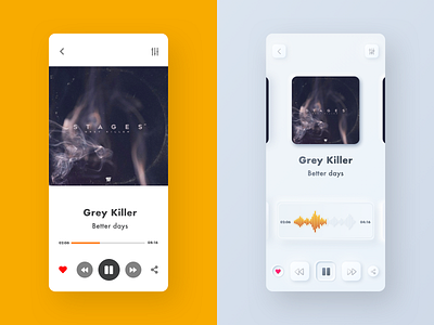
Flat vs. Neumorphic
I've seen a lot of this Neumorphic style lately. I must say I really love the look. The way everything becomes tactile, but still feels light with the greys and whites. It really makes me want to run my fingers along the edge of the buttons.
From a UX perspective though.. I'm afraid I must agree with the last podcast I heard about the trend. Everything does have a tendency to look like a button, whether it is or not. So to use this style would require some guidelines and a lot of attention to the visual hierarchy.
I think my design isn't too complicated, but then again, it has very few features.
Some things stay the same of course. As you can see in my design, changing the proximity of the Artist/Song name can still change its connection with either Album cover or the buttons.
Either way it's an interesting trend and I look forward to seeing what people will come up with.
If you have anything to add or your own opinions on the trend, please post it below. I'd love to hear what you are thinking.
