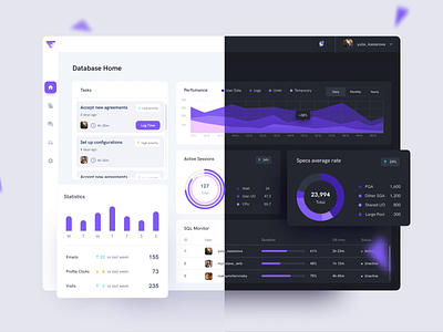
Dark UI vs Light UI
Dashboard colors have the power to improve significantly the data visualization design. Widget Customization is one of the previous works that I published this month and needed to build a light and dark UI for it. Therefore I present this modern animated transition emphasizing colors from different perspectives. I hope you like what you see.
More by George Railean View profile
Like
