Safety, intelligence & efficiency
Safety, intelligence & efficiency are at the heart of Safelink’s new brand identity, developed by the studio. The business has developed a secure work platform as a SAAS for legal, financial and professional services. The platform enables both internal and external parties to come together within one online cloud-based platform to securely share information and documents. The platform provides specially developed workspaces with built in tools to facilitate secure document collaboration, transactions, and dispute resolutions.
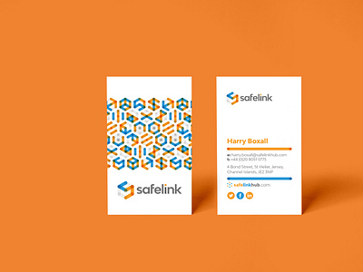
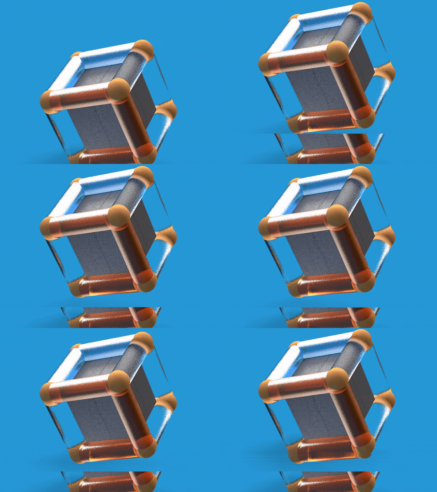
The marque itself presents links and bonds articulating activity within the platform, whilst the box acts as a metaphor for the secure, defined workspaces that Safelink’s clients work within.
We managed to connect the bonds to form an ‘S’ for the business initial and when translated into 2 of the other core features, Monkey Chain (the development part of the software that lets you create your own functionality and work-flows) and Titan Security (the multi-layered security framework developed by Safelink) we were able to continue the logo marque forming the T and M respectfully.
Beyond this there is a plethora of 2D and 3D logo marque language forming many representative symbols by manipulating the 2D hexagon and the 3 dimensional box. At first we invited viewers to visualise flat vectors and at others we invite them to witness a multi-layered extra dimension.
We have designed and developed a super smart web presence - www.safelinkhub.com and some printed offline collatoral as well with some Cine4D work thrown in.Much more to come from the communications but we’re stoked with the results and taking a complex matter and applying some design methodology and simplicity to the brand.


