Starting on the right foot
Our first conversation with Go Podiatry involved very little about feet. We began discussing healthy lifestyle, proactive wellness and marathon running, and finished on Italian scooters, mod fashion, and cafe culture. This project wasn't about a podiatry startup, it was a complete re-think of how we approach foot health and specialist care.
Go Podiatry believes that regular foot care is a foundation of physical wellness. "How can I keep running without damaging my feet", "I lack confidence being barefoot in public, what can I do to keep my feet looking their best?", "How can I stay active as I approach old age?" These are the questions Go Podiatry thinks we should be asking ourselves now.
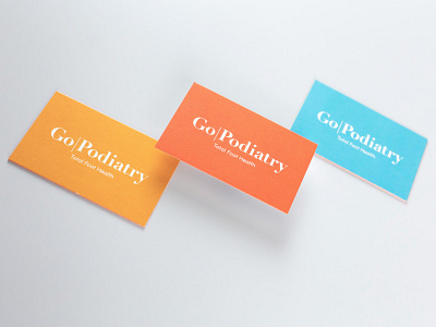
The brand is characterised by clean white space highlighted with strong flashes of color, specifically, Vespa colour charts and a certain blue and orange Gulf liveried Ford GT40 were the starting point. We were to avoid sterility at all costs, Go Podiatry's vision is for foot health to feel closer to visiting a spa than a hospital and bright colour is a key part of their clinic experience.
The website is simple and elegant but informative, feet are elevated as objects of beauty and function. You will find clear and concise information about common foot conditions and treatments, you won't find gross close-ups of verrucae. We helped Go Podiatry to integrate their online booking system and back office with a modern website that is easy for their team to manage and update.
So if you're having problems with your pegs, maybe you've waited a bit too long... never fear, if you want to start treating your feet like friends, Go Podiatry can help.


