Motorious – Article list


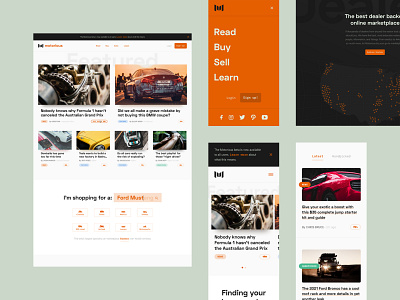
I went through various iterations of what the article list page should look like—here is the final direction.
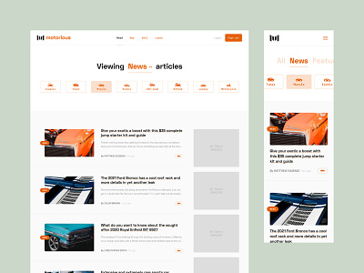
The body of the page is pretty self-explanatory aside from the right-rail of ads. As you can imagine, those blocks would scroll with the user as they browse the river.
I wanted Motorious to have a readable tone so that text and buttons weren't visually forced together. At the top, you'll notice the word "news" is interactive. When clicked, "viewing" and "articles" would fade and reveal the new selections you could make (all, news, featured, handpicked). The user could either side scroll, or click on a new selection, thus sorting the page based on one of the four categories. You could also sort by hobby segment using the buttons underneath the H1.
Since the mobile experience needed to be more concise, I decided to nix the copy and show the opening interaction. Visual cues cut the content/buttons to indicate that there is more to see off-screen.