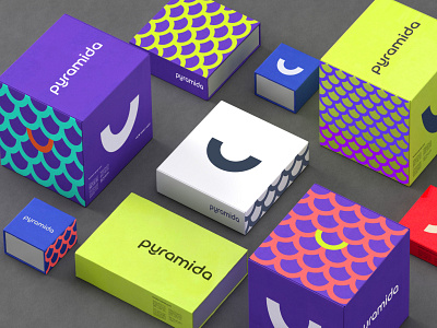
Pyramida
The updated style reflects the key standards of the new generation equipment production in its best way. You will never find fancy decor here, while the exceptionally corporate identity smile element taken from Y letter of the title appears within the main purple background. Such smiles are easily combined in funny patterns thus dramatically increasing brand recognition level. The red square existing in the previous style never disappeared but found its renaissance within the structure of P, A, M and D letters of the name, providing the font with the own unique style.
More by Reynolds and Reyner View profile
Like
