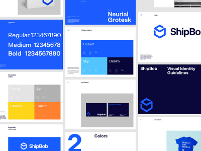
ShipBob - Brand Guidelines
Hello all,
Sharing some nice brand designs created for ShipBob. Thanks to Rokas for his great work on this project.
Last year we partnered with ShipBob, an eCommerce fulfillment solution for online brands.
ShipBob empowers you to run your e-commerce business with fulfillment centers near your customers and the tools to maintain control over inventory, orders, and shipments.
With $40m raised a year prior, ShipBob was ready to elevate its marketing strategy and set up an environment that will help its users to better understand its services, values, case studies and the brand overall.
How did we help?
We refreshed their brand with an updated logo, logotype, color scheme, ui design, and fully integrated WordPress environment for their new website.
We structured the CMS environment so their marketing team can easily scale up their efforts to better market and manage their online presence.
The design system has been created for ease of use and scalability, hence the visual language of the website is very simplistic and minimal. We created custom designs with a module-based approach, meaning the team can easily replicate modules, sections and whole pages with ease.
Services provided:
• Branding (by Rokas and Julius)
• Creative Direction (by Filip)
• Web Design (by Filip and Goutham)
• Print, brochures (Jakub)
• Illustrations (Vicente)
• Front-end Development (by Donny)
• WP Integration and CMS setup (by Dalibor and Marino)
