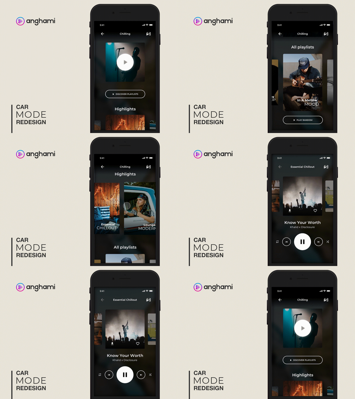
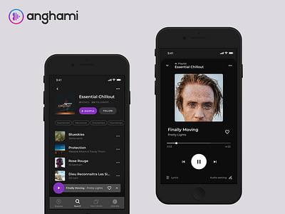
Car Mode Interaction Redesign - Anghami App
Following the path of the Anghami App project for better user experience and human-centric design, I have come up with more screens and mostly for a friendlier experience on the "CAR MODE".
I have always found this hard to operate (based on daily use) and also the car mode only starts on the final track screen (which is kind of useless if it is only to pause and play the music).
I hope I have made it better, let me know your thoughts on the section below, I'll be open to any suggestion.
- Complete case study on Behance
- Read about it on Medium
Thank you!
More by Younes ANNAKI View profile
Like

