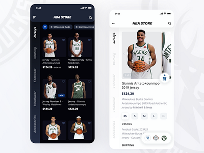
NBA Store Redesign
This is our take on the NBA store redesign, where we focused on both UX and UI issues. We started from a solid expert audit of the current NBA store to understand the information architecture and crucial usability issues. This phase was followed by the ux mockups and finally the designs in both light and dark versions. Hope you'll like it! Please press "L" if you think it's a 3-pointer :D
More by EL Passion View profile
Like
