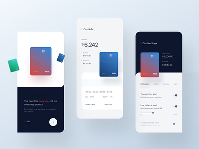
Banking Mobile App Concept
Hello everyone 👋
Today I want to break the silence with several screens from the banking application.
Over the past couple of years, I mainly work with fintech projects, it includes a huge number of restrictions, information and not the easiest user experience, because of which the visual part of the application often suffers.
At the beginning of any project, I try to ignore what prevents me from making the functional interface beautiful and also I make several concepts, as it were in isolation from reality and the technical side. This gives a better understanding of trends, their feasibility and helps to set a further rhythm of the development of the interface.
This is a kind of part of my “sandbox”, perhaps you will find in these works, something for yourself, maybe they will prompt you to some completely different thoughts, maybe they will help solve the problem that you have been working on for more than a dozen hours.
As we always say: "need to try” .
If you liked it, then don't forget to press L, hit Follow and subscribe to my social networks. 🙂
