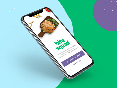
Bite Squad New Design
Bite Squad iOS App Login Screen.
One of the iterations we designed and tested. Even though this was one of my favorite options, displaying a clear value proposition, a clean look, and a concise benefit, it didn't perform really well. It lost to a more "crowded" screen.
It's interesting how, as designers, we make assumptions based on our own aesthetics. Reminds me to always test and pass everything through the user's POV.
More by Diego Bernabé View profile
Like
