CrossPoint Church 02
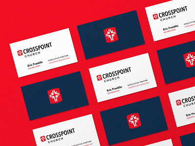
The CrossPoint Church brand identity updates were a game of inches—there was a lot of strength and equity built up in their current mark, so we focused on subtle refinements to the icon and their red (thanks for your eyes on this, @nathanholthus).
The logotype was updated to solve for scale relationship problems, improve readability and provide a stronger typographic foundation for the updated brand identity system.
More by Josiah Z. View profile
Like


