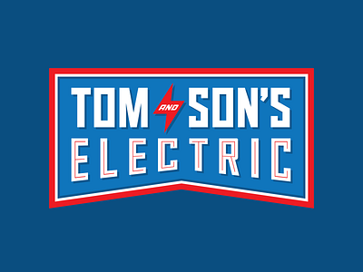
Tom & Son's Electric
Tom and Son's is a 3rd generation, family-run electrical business. I wanted to give them a retro look. For the type I landed on Titling Gothic by Font Bureau. But as the logo progressed, I started altering the letterforms to go for a more geo-slab feel. For example, the original rounded "C" from the typeface didn't translate well when I applied a shape warp. Customizing it, and other letters like S, O and R, give the whole logo a better connection to "Electric".
More by John Cross View profile
Like
