Studio Size
Hey guys!
After five years, we made a strategic decision to rebrand our agency and position ourselves as a branding and motion studio.
The brand identity was based on our “Small is beautiful” philosophy, which in short, means we’re focused on quality, not mass production.
We wanted our new identity to be simple and neutral so that our work comes to the fore.
On the other side, we wanted to express our versatility and love for motion graphics.
That’s why we choose black and white as our primary colors and a chromatic aberration effect as an element that makes the identity interesting and dynamic.
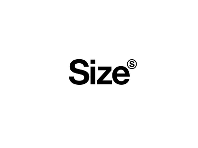
We wanted a simple logo that works both as a wordmark and a logomark.
That’s why we added the circled “S” which represents our name and our “small” size.
