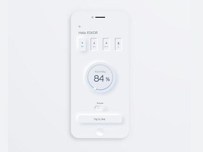
ɴᴇᴜᴍᴏʀᴘʜɪsᴍ ɪɴ ᴜsᴇʀ ɪɴᴛᴇʀғᴀᴄᴇs - App Design
ɴᴇᴜᴍᴏʀᴘʜɪsᴍ ɪɴ ᴜsᴇʀ ɪɴᴛᴇʀғᴀᴄᴇs ᴄᴏᴜʟᴅ ʙᴇ ᴛʜᴇ ᴛʀᴇɴᴅ ɪɴ 𝟸𝟶𝟸𝟶
Do you think it will be a main trend in 2020? What do you think about it?❓ Neumorphic design however pretends to extrude from the background. It’s a raised shape made from the exact same color as the background. When we look at it from the side we see that it doesn’t “float”. This effect is pretty easy to achieve by playing with two shadows colors, one at negative values while the other at positive. But for it to work our background cannot be fully black or fully white. It needs at least a tiny bit of tint so both dark and “light” shadows will be visible. You can use any hue for the background so it can be warmer or colder depending on your choice. But white and dark shadows have to be visible on it, if slightly.
The main benefit of this style is the „up-to-date". It brings that “modern or new 2020 feel” to the interface and make it stand out.
There are however some problems with it that need addressing. Two main problems we found so far (but we’re still looking) are:
Accessibility
Activation ( So I try it with this post)?
