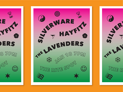
Wingdings Show Flier
For this flier I wanted to play with alternating curved text and reference the classic gig poster 2-toned gradient look.
But then I wanted to add some element to it that felt ridiculous, because my best designs come from doing something that feels silly and stupid and fun. So I played with wingdings as decorations - which actually wound up thematically matching different moments of the poster. In some cases. In others it was random and meaningless.
I knew that I'd be printing it on the risograph machine, like I do for many show fliers, so I was excited to try to achieve a seamless gradient with two overlapping colors. Check out the results here.
More by Ainsley Wagoner View profile
Like
