OODA logo anatomy
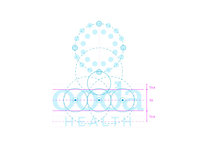


Since we had the direction for the new visual identity down, it was time to dig into the finer details and make sure were proportionally balanced across both the stacked and horizontal versions of the new logo. Here’s a breakdown of that anatomy and each logos corresponding clear space.