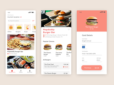
Checkout UI Challenge- Rebound Shot
Re-ordered the customer name and card provider details on the check out page. I realized this order makes more sense and follows the design pattern of other check out pages:)
More by Alex Zhang View profile
Like
