CPR – Media
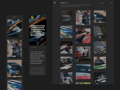
Early on, we knew that CPR wasn’t looking to have a separate feed for all of their media, so we built them a custom river and detail page.
To ease dev time and give users a familiar experience, I repurposed the filter bar and layout from the vehicle list page.
Although the detail page was designed for articles, I wanted to put together a “most case scenario” so that we could take elements away if needed. The only exceptions were videos and social media, which had different experiences. I guess you could say that the detail page was acting as a style guide for all the various pieces an article could have.
Once finished reading, the user could either click on the next article at the bottom or keep scrolling to load what was next. This made for a less jarring experience when navigating from post to post.
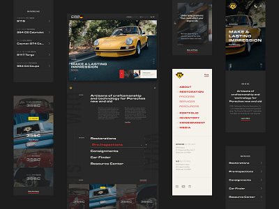
Having repurposed several layouts by now, the mobile screens followed a lot of what we came up with for the vehicle list and detail pages. My focus was mostly on making the article page a comfortable destination for mobile users.


